Color Psychology for Home Staging
Color can impact at a subconscious level. Artists and interior designers have long believed that color can dramatically affect moods, emotions, and feelings.
So, when thinking of staging your home, it may be crucial to choose your colors wisely. After all, how you stage your home can play a big role in how fast it sells. Onsite Property advises that the colors you choose for home staging should suggest the home’s efficiency, security, and comfort.
The following is how you can use the various colors in your home staging efforts.
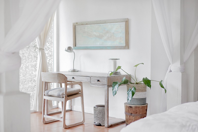
White
White colors usually communicate two things: clean and hygienic. White also gives the perception of a bigger space, especially for small spaces. So, use it to your own advantage when necessary.
However, too much of it can be straining to look at as it may communicate “Don’t touch me!” But you not only want buyers to touch it, but you also want them to call the place home.
What’s more, white color can also make a home feel cold and plain.
As such, avoid using too much white color. It can be a turn-off. For a contemporary look on your trim, opt for the shades. Good examples include Navajo white and antique white.
But unless you have a modern design scheme, it may just be best to choose a different color other than stark white.
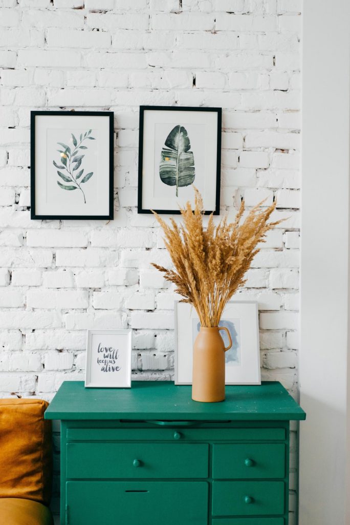
Green
Green is the color of nature and health. It’s associated with fertility, safety, freshness, harmony, growth, and the environment. Green is also traditionally associated with greed, ambition, banking, finances, money, and wall street.
The color green was also found to improve mood, according to research that focused on treatments for seasonal affective disorder.
When staging a home, consider using green for the home’s bedroom walls. Shades of more neutral greens, in particular, can give a sense of rest and harmony.
Another option is to try and scatter green plants throughout the home.
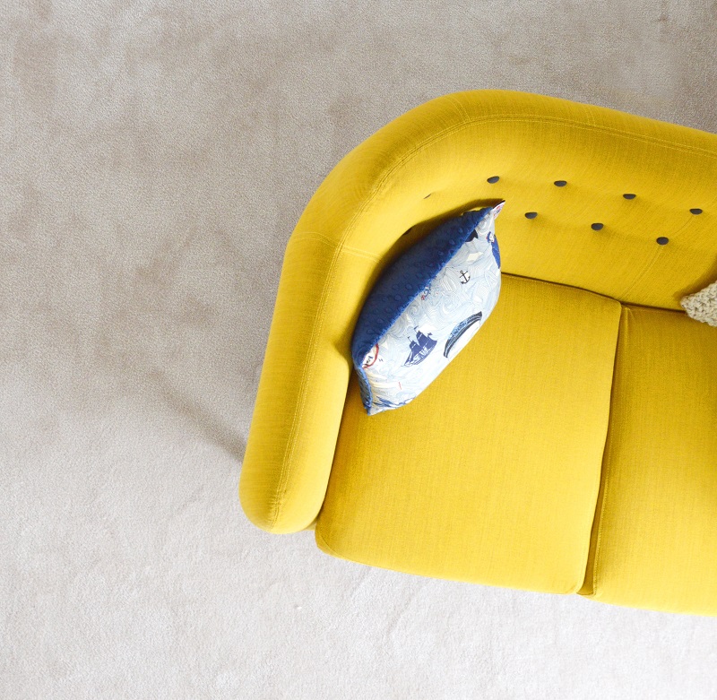
Yellow
The color yellow can be bright and intense, which is perhaps why it can evoke such strong feelings. Yellow means happiness and optimism; it’s the color of sun shining, or bright light and creativity.
That said, you want to avoid going overboard with it. Too much of the color can be overwhelming and you should only use it sparingly. As a matter of fact, too much yellow has been found to make some people depressed, fragile, or even suicidal.
Just like white and green, shades of yellow can do the charm. Using shades of yellow, especially in the basement can help liven it. Gold colors can also do the same for hallways and family rooms.
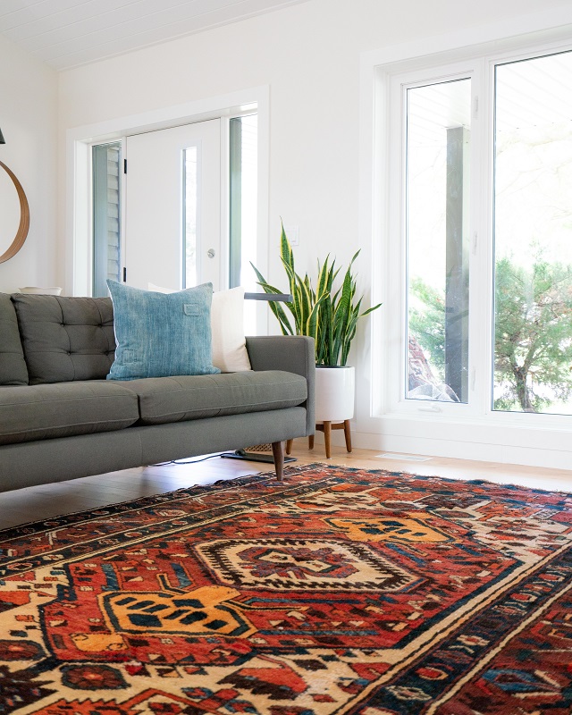
Blue
Blue is the color of the sky and the sea. It symbolizes truth, faith, intelligence, confidence, wisdom, loyalty, trust, and heaven. It is also gender neutral.
Blue tends to surface universally as the most favorite color. Nonetheless, “the blues” is the last thing you want to give people. In some cases, though, the color comes off as unfriendly or cold. Just like other colors, do not overdo it.
Using a soft blue in the bedroom or bathroom can work like a charm. It can offer a feeling of calming retreat.
You may even consider painting the color in a children’s room, too. Studies have found blue to invigorate people’s creativity.Red
Red is the color of fire and blood. For this reason, it is associated with power, strength, danger, war, energy, determination as well as passion.
A study found that it can make a person even more accurate and attentive to detail. To get the buyers’ eyes right to where you want them, you may use a vase of red flowers on those sparkling granite countertops or red accessory on the fireplace mantel.
Purple
Use purple to add a luxurious feel. It’s often associated with royalty and wealth, although it’s surprisingly versatile with so many different shades. Use its richness to elevate a room to capture a buyer’s attention and create a more mature yet inviting and calming environment.
While the most intense shades of violet or eggplant indicate a luxurious feel, lighter shades of lilac, lavender, or orchid can evoke calm, maturity, and creativity.
Some Mistakes to Avoid
One mistake to avoid with colors when home staging is using the wrong paint finishes. Finishes are available in a wide variety, ranging from high gloss to matte. You should choose one that heightens the appeal of your walls’ paint colors.
So, before applying it on your walls, make sure to test the finish on a small area first to see how it looks.
The next mistake to avoid is overpowering the room’s décor. Focus on creating as much harmony between the paint colors you choose and the furnishings you’ll have when staging.
There you have it. Choosing a proper interior paint colors for home staging can help make your home sale much easier.
Article submitted by: Ryan Williamson – Onsite Property Management Services in Fort Collins
 White colors usually communicate two things: clean and hygienic. White also gives the perception of a bigger space, especially for small spaces. So, use it to your own advantage when necessary.
However, too much of it can be straining to look at as it may communicate “Don’t touch me!” But you not only want buyers to touch it, but you also want them to call the place home.
What’s more, white color can also make a home feel cold and plain.
As such, avoid using too much white color. It can be a turn-off. For a contemporary look on your trim, opt for the shades. Good examples include Navajo white and antique white.
But unless you have a modern design scheme, it may just be best to choose a different color other than stark white.
Green
White colors usually communicate two things: clean and hygienic. White also gives the perception of a bigger space, especially for small spaces. So, use it to your own advantage when necessary.
However, too much of it can be straining to look at as it may communicate “Don’t touch me!” But you not only want buyers to touch it, but you also want them to call the place home.
What’s more, white color can also make a home feel cold and plain.
As such, avoid using too much white color. It can be a turn-off. For a contemporary look on your trim, opt for the shades. Good examples include Navajo white and antique white.
But unless you have a modern design scheme, it may just be best to choose a different color other than stark white.
Green
 Green is the color of nature and health. It’s associated with fertility, safety, freshness, harmony, growth, and the environment. Green is also traditionally associated with greed, ambition, banking, finances, money, and wall street.
The color green was also found to improve mood, according to research that focused on treatments for seasonal affective disorder.
When staging a home, consider using green for the home’s bedroom walls. Shades of more neutral greens, in particular, can give a sense of rest and harmony.
Another option is to try and scatter green plants throughout the home.
Yellow
Green is the color of nature and health. It’s associated with fertility, safety, freshness, harmony, growth, and the environment. Green is also traditionally associated with greed, ambition, banking, finances, money, and wall street.
The color green was also found to improve mood, according to research that focused on treatments for seasonal affective disorder.
When staging a home, consider using green for the home’s bedroom walls. Shades of more neutral greens, in particular, can give a sense of rest and harmony.
Another option is to try and scatter green plants throughout the home.
Yellow
 The color yellow can be bright and intense, which is perhaps why it can evoke such strong feelings. Yellow means happiness and optimism; it’s the color of sun shining, or bright light and creativity.
That said, you want to avoid going overboard with it. Too much of the color can be overwhelming and you should only use it sparingly. As a matter of fact, too much yellow has been found to make some people depressed, fragile, or even suicidal.
Just like white and green, shades of yellow can do the charm. Using shades of yellow, especially in the basement can help liven it. Gold colors can also do the same for hallways and family rooms.
Blue
Blue is the color of the sky and the sea. It symbolizes truth, faith, intelligence, confidence, wisdom, loyalty, trust, and heaven. It is also gender neutral.
Blue tends to surface universally as the most favorite color. Nonetheless, “the blues” is the last thing you want to give people. In some cases, though, the color comes off as unfriendly or cold. Just like other colors, do not overdo it.
Using a soft blue in the bedroom or bathroom can work like a charm. It can offer a feeling of calming retreat.
You may even consider painting the color in a children’s room, too. Studies have found blue to invigorate people’s creativity.
Red
The color yellow can be bright and intense, which is perhaps why it can evoke such strong feelings. Yellow means happiness and optimism; it’s the color of sun shining, or bright light and creativity.
That said, you want to avoid going overboard with it. Too much of the color can be overwhelming and you should only use it sparingly. As a matter of fact, too much yellow has been found to make some people depressed, fragile, or even suicidal.
Just like white and green, shades of yellow can do the charm. Using shades of yellow, especially in the basement can help liven it. Gold colors can also do the same for hallways and family rooms.
Blue
Blue is the color of the sky and the sea. It symbolizes truth, faith, intelligence, confidence, wisdom, loyalty, trust, and heaven. It is also gender neutral.
Blue tends to surface universally as the most favorite color. Nonetheless, “the blues” is the last thing you want to give people. In some cases, though, the color comes off as unfriendly or cold. Just like other colors, do not overdo it.
Using a soft blue in the bedroom or bathroom can work like a charm. It can offer a feeling of calming retreat.
You may even consider painting the color in a children’s room, too. Studies have found blue to invigorate people’s creativity.
Red
 Red is the color of fire and blood. For this reason, it is associated with power, strength, danger, war, energy, determination as well as passion.
A study found that it can make a person even more accurate and attentive to detail. To get the buyers’ eyes right to where you want them, you may use a vase of red flowers on those sparkling granite countertops or red accessory on the fireplace mantel.
Purple
Use purple to add a luxurious feel. It’s often associated with royalty and wealth, although it’s surprisingly versatile with so many different shades. Use its richness to elevate a room to capture a buyer’s attention and create a more mature yet inviting and calming environment.
While the most intense shades of violet or eggplant indicate a luxurious feel, lighter shades of lilac, lavender, or orchid can evoke calm, maturity, and creativity.
Some Mistakes to Avoid
One mistake to avoid with colors when home staging is using the wrong paint finishes. Finishes are available in a wide variety, ranging from high gloss to matte. You should choose one that heightens the appeal of your walls’ paint colors.
So, before applying it on your walls, make sure to test the finish on a small area first to see how it looks.
The next mistake to avoid is overpowering the room’s décor. Focus on creating as much harmony between the paint colors you choose and the furnishings you’ll have when staging.
There you have it. Choosing a proper interior paint colors for home staging can help make your home sale much easier.
Article submitted by: Ryan Williamson – Onsite Property Management Services in Fort Collins
Red is the color of fire and blood. For this reason, it is associated with power, strength, danger, war, energy, determination as well as passion.
A study found that it can make a person even more accurate and attentive to detail. To get the buyers’ eyes right to where you want them, you may use a vase of red flowers on those sparkling granite countertops or red accessory on the fireplace mantel.
Purple
Use purple to add a luxurious feel. It’s often associated with royalty and wealth, although it’s surprisingly versatile with so many different shades. Use its richness to elevate a room to capture a buyer’s attention and create a more mature yet inviting and calming environment.
While the most intense shades of violet or eggplant indicate a luxurious feel, lighter shades of lilac, lavender, or orchid can evoke calm, maturity, and creativity.
Some Mistakes to Avoid
One mistake to avoid with colors when home staging is using the wrong paint finishes. Finishes are available in a wide variety, ranging from high gloss to matte. You should choose one that heightens the appeal of your walls’ paint colors.
So, before applying it on your walls, make sure to test the finish on a small area first to see how it looks.
The next mistake to avoid is overpowering the room’s décor. Focus on creating as much harmony between the paint colors you choose and the furnishings you’ll have when staging.
There you have it. Choosing a proper interior paint colors for home staging can help make your home sale much easier.
Article submitted by: Ryan Williamson – Onsite Property Management Services in Fort Collins